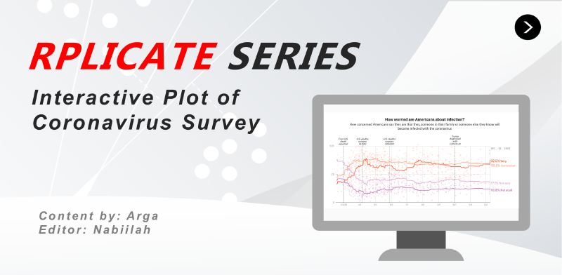
Welcome again to the Rplicate Series! In this 5th article of the series. On this occassion, we will try to replicate the first interactive plot from the FiveThirtyEight article titled How Americans View The Coronavirus Crisis And Trump’s Response. This time you’ll learn how to build an interactive plot using highcharter.
Library and Setup
Below is the required package that we will use during data wrangling and chart creation.
|
|
Data Collection
All data is available directly from the article below the plot. You can directly download them or visit this link.
Concern Top Line
We load the data that correspond to the line for each survey responses. On the survey, people can choose between four different responses: Not At All, Not Very, Somewhat, and Very for both their concern about economic and the viral infection.
|
|
|
|
In this part we will convert the data and do the following process:
- Convert
modeldateinto date format - Filter data to only concern about infection
- Create long format table from the four responses
- Tidy the responses category name
- Prepare the output for the chart tooltip
- Create a new column that transform
modeldateinto proper timestamp format forhighcharter
|
|
|
|
Survey Polls
We will load the Survey Polls regarding poeple concern about COVID-19.
|
|
|
|
There are two type of polls, concern related to economy and concern related to health risk and safety. We will use the later one.
|
|
We will do similar step to prepare the long format version of the data. For the date we will use the end_date of each survey. If the sponsor the survey is missing/NA, we will italic the data. The <i> symbol indicates that we will italic the text.
|
|
|
|
Event
As the vertical line that notify important event, we will manually create the data.frame with information gained from the original plot.
|
|
|
|
Here, I directly transform the event data into HTML format to suite the text shown in the original plot. The date are also transformed into timestamp so they will properly positioned in the highcharter x-axis.
<i>: italic<br>: line break
|
|
|
|
Prepare Color
Here we will prepare the color of each responses category. For the scatter plot, we will use transparent color by transforming the color using hex_to_rgba() and set the transparency into 0.2. You can use the colorpick eyedropper extension from Google Chrome if you want to get the color yourself.
The color_group will be used to indicate the color both for the line chart and the scatter plot.
|
|
Tooltip
Finally, we create the tooltip for each data. For the line chart, we set the font size to 14 pixels using font type of Roboto Slab (you can see all available font from Google Font API). For the scatter plot, we will show the responses and the percentage, the pollster and the sponsor. This part is different from the original plot that completely remove all tooltip from the scatter plot. All fonts from the Five Thirty Eight are commisioned fonts we can’t get them directly.
|
|
|
|
Visualization
Finally, we create the interactive chart using highcharter. First, we will create the basic plot, including the scatter plot and the line chart. To remove the legend form the chart, we use the hc_legend() and set the color using the hc_color. The hcaes is where you will include the information regarding the x-Axis, y-Axis, and the color grouping based on the responses category.
|
|
Next, we add the setting for the chart title, subtitle, x-Axis and y-Axis. During the creation of the x-axis, we also include the vertical line that correspond to important events related to COVID-19 using the plotLines.
|
|
Finally, we add the setting for the tooltip. The tooltip is the most challenging part since the highcharter cannot fully replicate the tooltip from the original plot.
|
|