Welcome again to the Rplicate Series! In this 6th article of the series, we will replicate The Economist plot titled “Marvellous”. In the process, we will explore ways to use bold text and characters for our axes. Let’s dive in below!

Load Packages
These are the packages and some set up that we will use.
|
|
|
|
|
|
Dataset
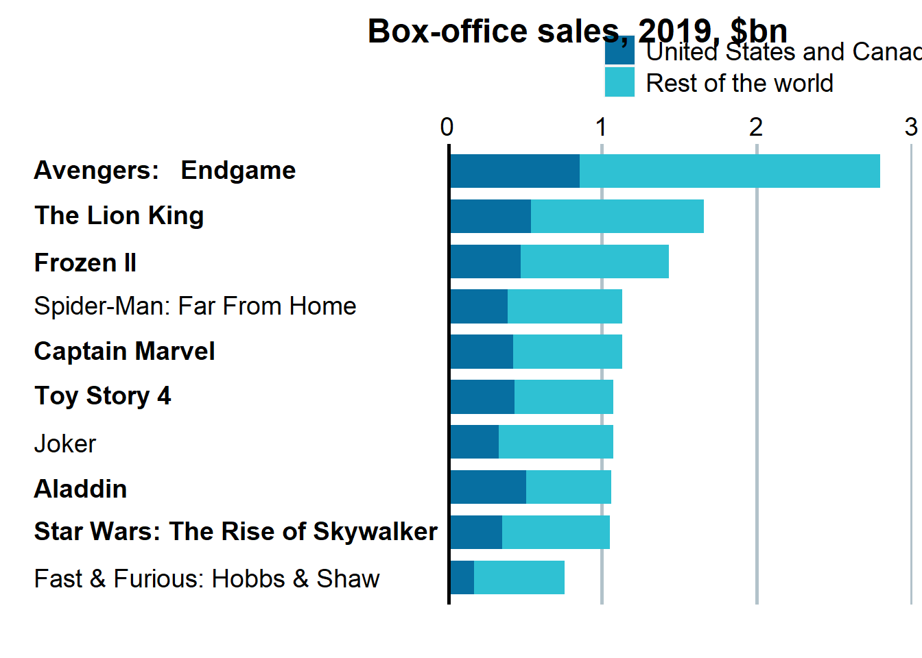
The plot that we are going to replicate comes from this article. It contains information about sales and market shares of Disney Box Office in United States, Canada, and around the world in the year of 2019.
First Plot (Bar Plot)
Data Wrangling
Before making a visualization, let’s prepare and clean the data:
|
|
|
|
In this visualization, we only use the first 11 row of data and column Movie, Worldwide Box Office, and International Box Office. Therefore let’s select these data and rename some column.
|
|
|
|
Since there’s no information about “Jumanji” movie inside the plot, it is best to remove it from the data.
|
|
Next, we will also perform some string manipulation to replace special character like “$” and “,” into a blank space. This is to make sure that we can convert the columns into its correct data type.
|
|
|
|
Now, let’s also transform the original wide-format data frame into its long-format for easier plotting.
|
|
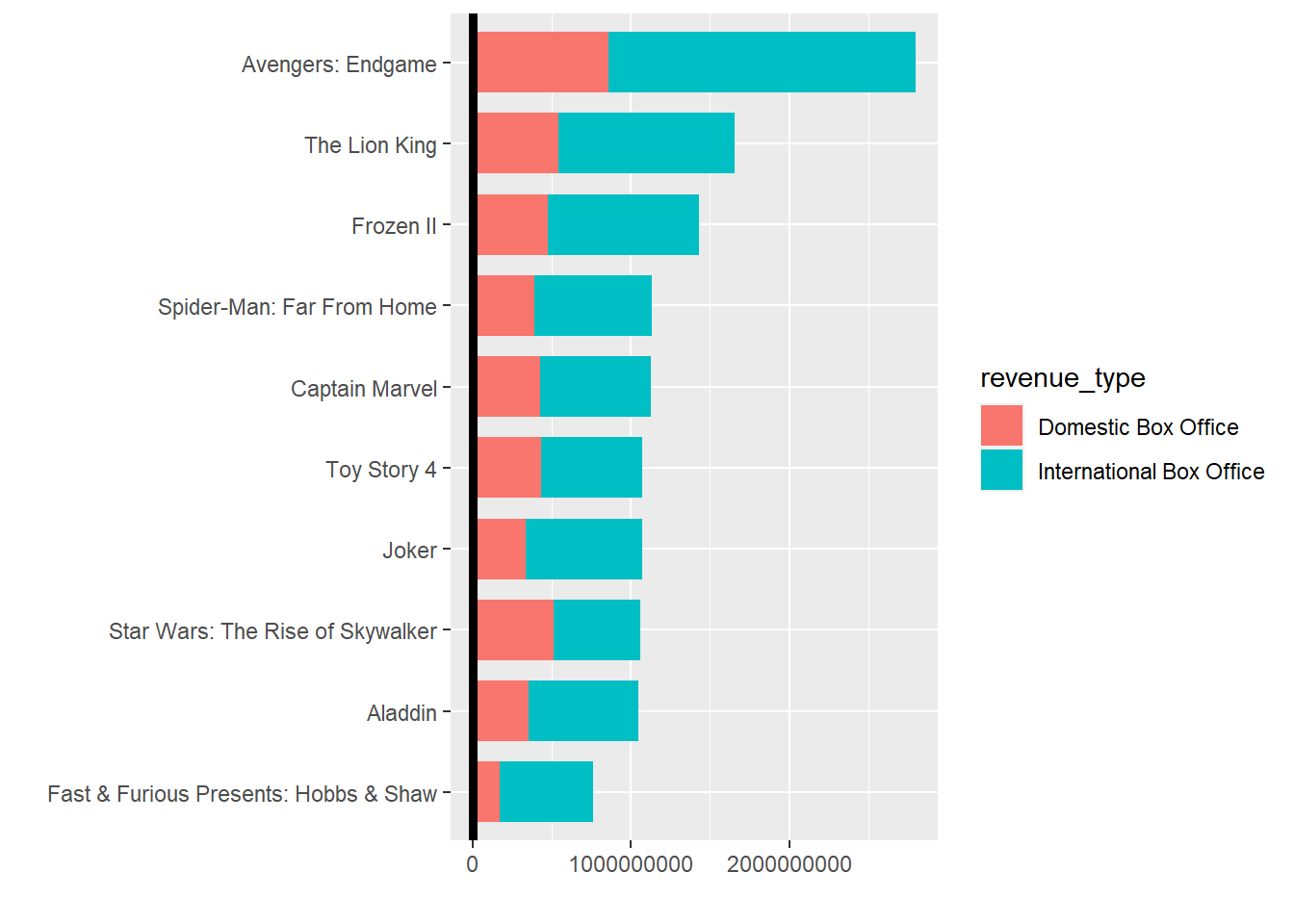
Create Visualization
|
|
We need to declare specific format for x-axis and y-axis text. Namely, bold character for specific movie and additional “>” character with its red color. We can use function expression(). Here is the code below:
|
|
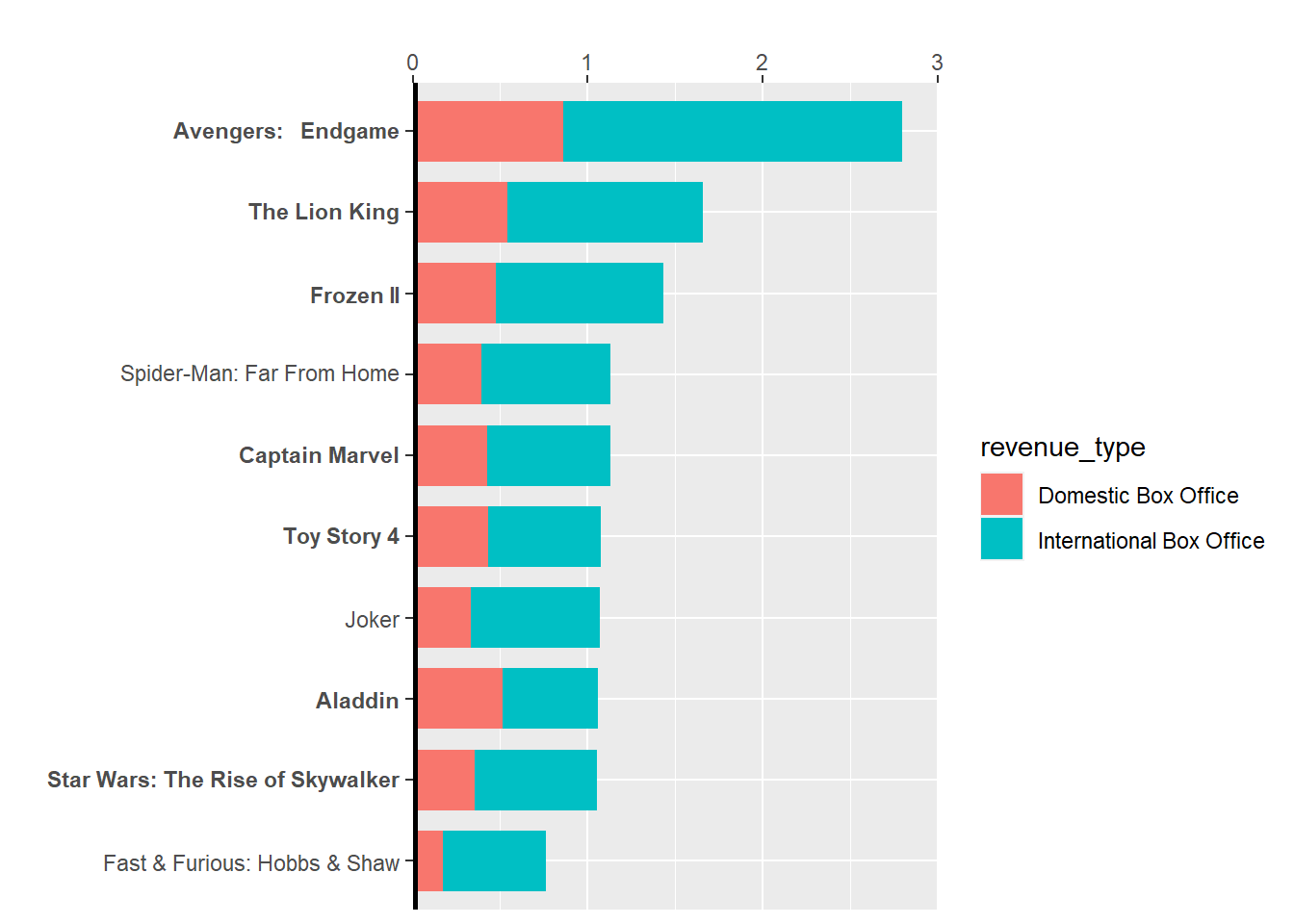
|
|
 And then we can apply theme into the plot:
|
|
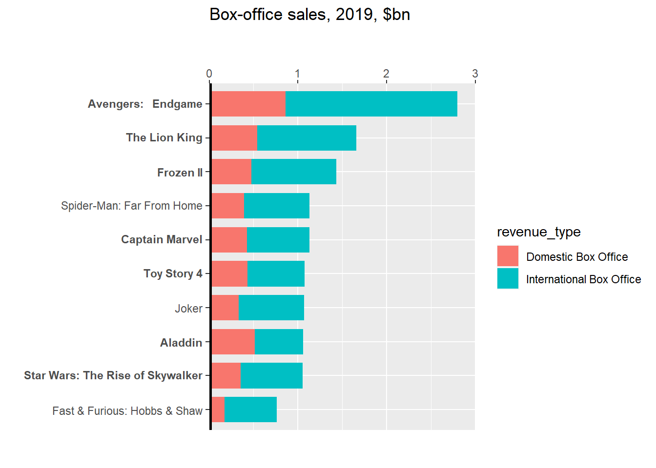
 ## Save Plot
After all of the visualization steps above were done, we can save the plot into a png file. To apply an arrow “>” symbol, because ggplot haven’t yet provide feature to accomodate it, we can apply it using grob text. And here below the result.
|
|

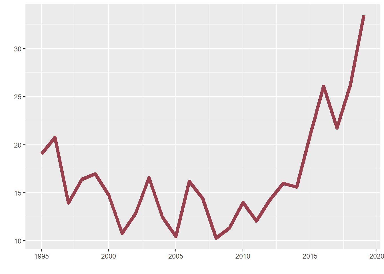
Second Plot (Line Plot)
Data Wrangling
Before making a visualization, let’s prepare and clean the data:
|
|
|
|
We will drop some columns and filter some data:
|
|
|
|
Now, we will replace special character “%” into a blank space and convert the Market Share data into its correct data type.
|
|
|
|
Create Visualization
|
|
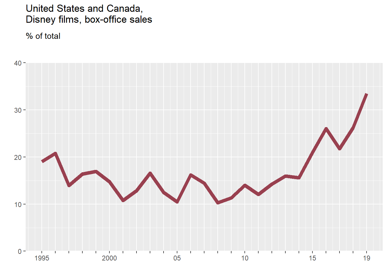
We need to declare the axis text and add some title and subtitle inside the plot, here is the code below:
|
|
Next, we need to customize y-axis text using grob text, because text needs to be put inside the plot:
|
|
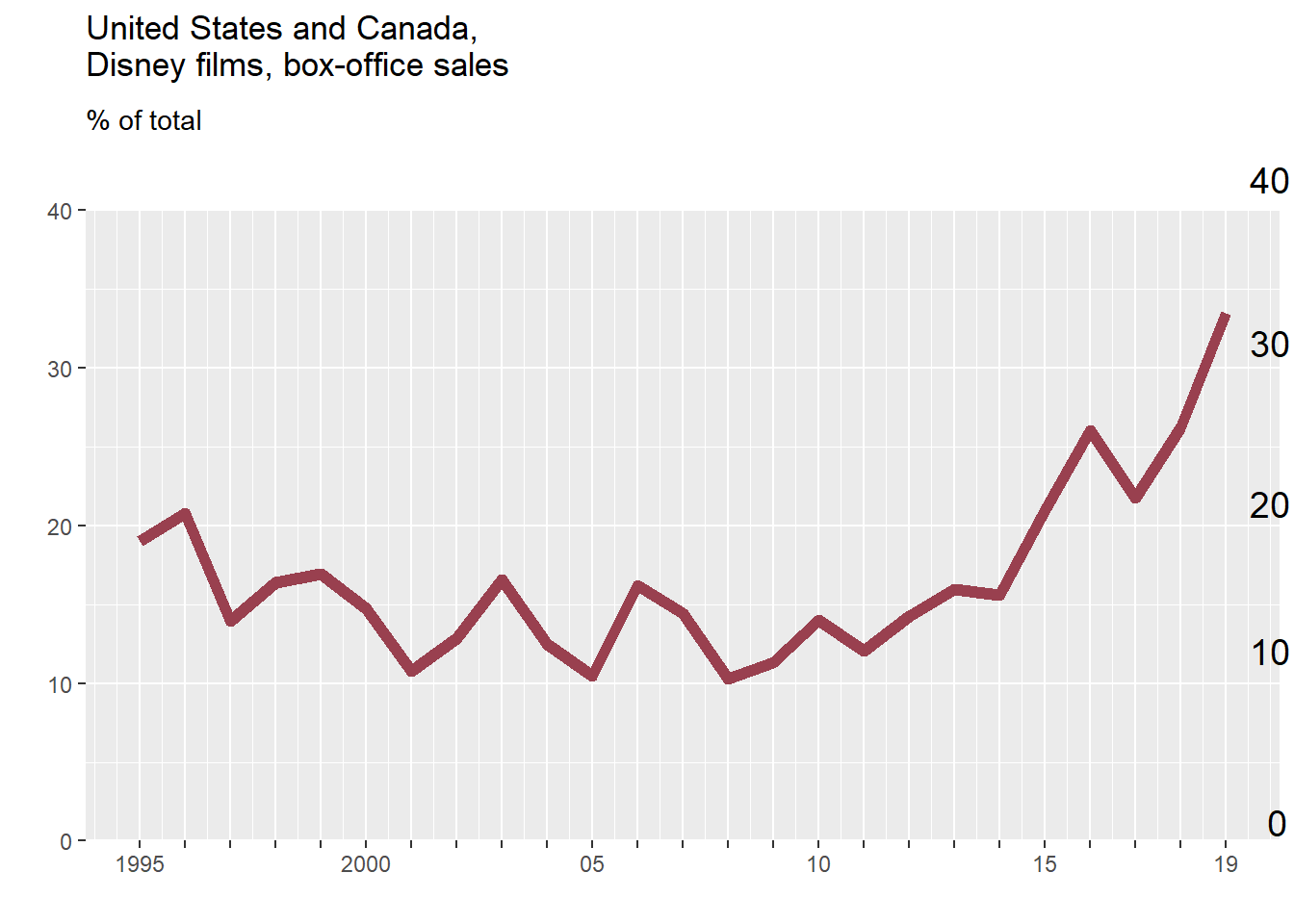
Then, we can add theme into the plot:
|
|
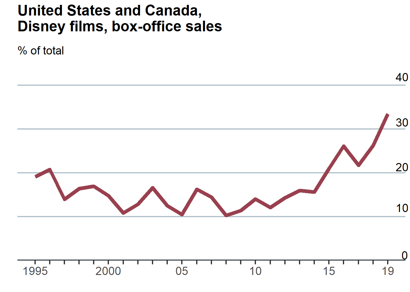
Save Plot
After all of the steps were done, we can save the plot into png file:
|
|

Combine Plots
In this finishing step, we will combine two plot into one plot and add plot accessories like caption and header.
|
|
Finally, here is the final replicated plot using ggplot2! Looks nice!
